Monday, March 8, 2010

pERSPECTIVE/PERception

Perspective is quite intriguing and can be applied across the board in all aspects of life: whether discussions regarding personal struggles, a bad relationship, a new friend, optimism versus pessimism or viewing artwork. Our perspectives and our perceptions can be extremely similar or can be at total opposite ends of the spectrum. Tricky indeed pertaining to art when observing the same composition and it evoking meaning to you that did not resonate in another person. Livingstone begins her chapter, “From 3-D to 2-D: perspective,” discussing the challenge that many artists face concerning representationalism. As an artist myself, it definitely can be problematic to portray the three-dimensional world I see onto a two-dimensional canvas. Preservation of the frontal plane is key and obtaining the desired depth. The subject matter and how accurate I want to be in my depictions and consideration of the medium I am working with all play a vital role in this portrayal of 3-D onto a 2-D surface. Representationalism of depth perception would present itself differently in an impressionist painting divergent to an abstract painting and the use of gouache versus acrylic for instance.


The location in depth of frontally oriented surfaces has been shown to be by a number of perceptual factors. In order to make depth relationships visible artists make the eye grasp the representation of space directly. The viewer can then infer the relative spatial position of objects in paintings. The artist controls the frontal plane to make sure there is unity of the work. This enhances the interplay between the positive figures and the negative, aiding to the expression of the overall composition. Arnheim states that the perceptual effect conveys the expressive meaning of the work. He continues to say that knowledge determines the spatial effect only when perceptual factors are absent or ambiguous. Yet in the next breath, he says that these situations are useless artistically because in them the spatial structure of the visual field is overruled by non-perceptual agents. This is where he perplexed me a bit. There are so many rules to consider in order to maintain accurate perceptions of the spatial structure of a composition.


Arnheim throws me off again, “no intention and no skill, will ever make the depth effect truly complete, except on the far away ceiling of a church or in combination with stage tricks? Why is this Why does the physical space of a picture remain a flat surface to its observer? Is it because of our inability to perceive 3-Dimensionality precisely onto a 2-Dimentionality surface? Are there varying perceptual effects that apply when conveying architecture; specifically open and solid areas, the function of doors, colonnades and ornamental elements that make the depth effect process or goal a success? What are the rules for figure ground representation with depictions of people and other non-structural designs?


Sorfori "Jazz"...Artist from Ghana I felt that this composition was an excellent example of depth perception and how perspectives can differentiate within a single piece.

Sunday, March 7, 2010

Les Demoiselles d’Avignon: The Use of Art Schema


I would like to build on Solso’s analysis on Les Demoiselles d’Avignon. Solso brings up the similitude between Picasso’s rendering of the ladies and the Egyptian’s images of women and African masks. The artist “drew partially recognizable features from different views on the same canvas.”


The women in the painting are held in mid action. One woman is entering into the visual frame from the left. Her eyes as Solso had mentioned is represented in a similar fashion as Egyptian art. Her arms are rendered in a cylindrical shape, giving her the illusion of three-dimensionality. Another woman is crouching with her back to the spectator. She wears a mask that is eerily swivelled towards the back of her head. The woman on the right drawing the curtain is entering the scene. The two central women with arms held up is half covered in what appears to be a sheet. They appear to be echoing a more traditional image of the female nude. They are posing like renditions of Titian’s Venus and stand in stark contrast to the dynamic qualities of the masked figures.


So there is a mixture between representations of traditional European beauty and art in the two central females, and the other three with masks on. There is also a mixture in dimensional representation. The image as a composite is a depiction of a brothel with women all vying for the male spectator’s attention, but there is a severe lack of cohesion in spatial and linear perspectives in the painting. The figures and the ground are being held by the situation of the frame only and the contextual fact that all figures are nude. Each woman appears separate from one another and from the space that surrounds them.They appear unaware of one another occupying the same space. They seem to be jumping out of the canvas.


This separateness contributes to an image of anxiety. The painting is a prelude to Cubism; it also marks an anxiety towards inter-racial sexual relations. The crudely drawn image of the sacred African masks seems to tug at the spectator’s consciousness of the idea of sexuality and male dominance to take in a woman from an exotic culture. The masked pros who are situated around the unmasked figures, in their juxtaposition with the unmasked appear to be acting in aggression against the male fantasy of the commodified woman.


However, Picasso’s painting does even more than mark aggression from a gender being treated as objects, but by applying the masks he addresses the idea of exotic cultures being preyed upon by men. Picasso exposes an implicit truth about racial relations in Western culture where the male sex sexually exploits a gender and a culture. However, Picasso’s effect is twofold, a female spectator could discern from her own personal schema and art schema.


If this is indeed a brothel then we the spectators are forced to take on the role of the customer. Picasso’s placement of African masks over the faces is not simply as a symptom of stylistic influence of African-Oceanic tribes, but the discomfort stunts the viewer in gazing at the prostitutes.


Upon first glance the image of Picasso’s Les Demoiselles d’Avignon is at once jarring and frightening because of the unconventional visualization of the painted female nude on a 96in. x 92in. surface. With all five female figures nearly lifesize standing before the observer, the image addresses the spectator more than any other work before. Picasso violates lines of spatial and linear perspective in the painting and uses multiplicity of art styles and geometric form to work off the spectator’s personal art schema. Relying heavily on top-down processing in this engagement with the art schema artwork unleashes startling political implications. While the visual dissonance of Picasso’s innovative formal techniques strikes the viewer with corresponding discomfort.


How did everyone else interpret this painting and did you get the same immediate reaction as I did from the discordant mixing in style, perspective, and form?

Schemata and Depth

This week, the Livingstone and Solso readings kept sparking off thoughts for me--as Solso would say, my personal schemata kept distracting me from the readings and sending me off on other tangents.

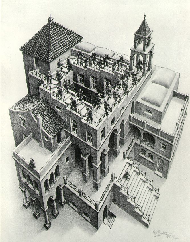
First, I thought Solso described the process of making canonical images, and our dependence on/propensity towards storing prototypical images in an illuminating way--articularly as relates to viewing art. We've talked before in class about how each of us, after organizing the visual information, applies his or her own personal experience and knowledge to the work. Solso described how artists can work within schemata, or play against our expectations, creating tensions that can make art disturbing, thought provoking, and memorable. Here I thought of Escher--linking, actually, the ideas of those tensions and the earlier chapter on perspective. Escher creates images that both confirm and deny our expectations of the visual world--he tricks us into thinking the stairs in this piece are continuous. They appear one way, manifested in two dimensions on the page, but our logical experience resists the visual evidence, giving us that eerie gap between what's real, what's possible, and what we're seeing.


I also appreciated Solso's description of how we create larger schemata that encompass, say, baroque art, or impressionist art, or Christ figures. I had an odd experience last fall--when traveling in Paris, I went to the Louvre and saw the painting below. Before looking at the title (or, rather, the translated title card, since I don't read French), I was bemused as to the subject. I thought, "This must be a Madonna and Child painting, because of the colors and the attitudes of the figures and the time at which it was painted...", and yet another part of me resisted this interpretation because I had never seen a painting in which Mary was nursing and had a breast exposed. It didn't fit with my Madonna/Child schemata. Yet, of course, this is a representation of Mary and child, and once I had registered that within my consciousness, suddenly in every museum I went to I found a painting of Mary nursing. Because I'd never noticed it before, the idea of a bare-breasted Madonna was not part of my experience of art--but once I had seen one example, I was able to incorporate many more images into my schemata.


Did anyone else do the depth perception tricks? I happened to be holding a mechanical pencil when I read that passage, and it was quite hard to insert the lead with one eye closed. However, the other little trick--trying to connect your index fingers--was quite easy. I later tried a needle and thread and experienced the same trouble as with a pencil. Then it came to me that obviously I'd be able to touch my fingers together without visual cues, because I can do it with my eyes closed, based on my kinesthetic awareness of my own body. This led me to question our reliance on visual cues for certain tasks--or rather, to wish to know more about the interdependence of visual cues and kinesthetic cues. For example, I'm not an extremely experienced knitter, but I have been knitting for years, and can make quite complicated things. Yet I can't knit without looking at the work, even though so much of it is based on fine motor control memory. Surely if I can type without looking at my fingers, I should be able to knit. Is my inability to do so caused by a false reliance on visual cues? In other words, if I turned out the lights and tried to knit would I find that it was easy, based simply on the sense of touch? Are we blind (forgive the pun) to certain over-reliance on sight?

A third personal connection I made to the readings--Livingstone talked about various methods artists employ to "flatten" their visual scene, in order to render it two-dimensionally. I spent a lot of time seeing if I could do the same thing, lose my sense for the depth of my visual field--and then I realized I already had my own method for this. Its aim is different, however. I'm a stage manager, and when calling cues during a show it's often necessary to be able to see the entire stage at once--if, say, you have a sound cue based on one actor's movements and a light cue based on an actor on the other side of the stage. To acheive a full-stage focus you have to relax your gaze and let it hover a little above everything--I find that this makes it seem as though I'm watching a flat picture, like on a television. I do this so I can see everything, not specifically to lose depth perception, but it's interesting that it has the same effect. I've also noticed that it makes movement much more noticeable. I wonder if this is because my brain is trying to latch onto depth cues--as Livingstone and Solso both explained, relative movement is one of our primary ways of perceiving depth--just as I'm consciously trying to remove them.

Depth and Schemata


I found this week’s reading very interesting because they, like many parts of this class thus far, made me analyze aspects of artistic and everyday visual perception in a way that I was not accustomed to, and allowed me to see and conceive of many things I hadn’t considered. For this reason I particularly like the two Solso chapters, and I consistently found myself amazed at the distinctions he brought up and the way they were illustrated.


In chapter 7, he outlines the ways that we analyze the space between objects through monocular depth cues. He describes how our assessment of relative size is affected by both size of the image that is seen (bottom-up processing) and knowledge of the object (top-down processing), and how occluded objects tend to appear as complete but layered shapes. I found his examples of shadow particularly riveting; not only does the addition of darkness and highlights create the illusion of depth in a two-dimensional image, but that concavity and convexity can be reversed with the simple reversal of those shadows (by turning the picture upside down, for example). He includes orientation, elevation within the frame, linear perspective, and texture gradients, and makes very interesting claims about how color influences depth perception in relation to atmospheric depth (where colors and shapes become more blurry, pale, and blue as they recede) and the fact that warm colors simply advance to the foreground over cool colors. The church in Milan was a particularly fascinating example of these tools at work (I had to stare at the photograph for several minutes before I could convince myself that it was not in fact three-dimensional).


I ran into trouble with these depth cues, however, in Arnheim, when he claims that the United States map provides unreal depth effects that must be avoided: “...we see that a corner of Wyoming lies on top of a corner of Utah, and that a corner of Colorado lies on top of Nebraska. No knowledge that this is not so prevents us from seeing what we see” (p. 248). As I read this section, I was perplexed, as I didn’t think I had ever experienced the illusion before; of course when I looked at a map I immediately saw it this way, having just read the chapter (for the life of me I cannot now remember if I ever saw the states as overlapping now). What interested me beyond this point, however, as I was looking at the map more thoroughly, was how states like Pennsylvania, New Mexico, Missouri, Mississippi, Montana, Florida, etc. did not provide this illusion to the same extent, unless I tried very hard to make it happen. Firstly, I hypothesized that our general schema of maps (see next paragraph) presupposes that states/countries border each other rather than overlapping, and that they are not perfect, simple shapes. When the states do remind us of more simple shapes (e.g. the rectangle-shaped states of the West), the overlapping illusion is easier to sustain, or for Arnheim, impossible to escape.


Part of this is of course related to chapter 8 in Solso, where he explicates prototypes and how they influence how we think things should appear as opposed to how they do appear. Solso explains that certain schemata, derived from our experiences with the world, are activated when we participate in certain activities, telling us what to expect. In this way, Solso argues, and I am quite inclined to agree, that though all viewers perceive a visual stimulus in the same way (i.e. light is reflected off of it, which falls on the retinas, and signals are sent to the brain), this stimulus will activate different schemata that will result in the stimulus being experienced in a different way. In other words, the semantic value or “meaning” of the stimulus will change.

These schemata become abstracted into prototypes, Solso says, which in turn can influence our conceptualization of art and perception of individual art objects. Particularly, art often serves to violate these prototypes resulting in visual dissonance and psychological tension. In some ways, Solso seems to claim that this is in fact the purpose of much of art, “to demand active participation [from the viewer] in the construction of ‘reality’” (p. 237).


Finally, Solso also revisits the question of artists and scientists, brought up somewhat facetiously in the Wade article (I think?) from a few weeks ago. Solso, however, puts artists and scientists in the same camp, seeking out aspects of perception that excite viewers in some way. He says artists “do not invent art” in the same way that scientists do not invent science: “As scientists discover the laws of the universe that are congruent with mind, artists discover visual images of the world that are harmonious with mind” (p. 257). Of course, “harmonious” can have many different meanings, and I don’t think Solso intends to exclude visual dissonance. In fact, I think he means that dissonant with expectation or not, art (or perhaps “successful” art, just like successful theories) accords with the mind in such a way that it merges with the mind of the viewer and provokes thought.

Schematic Skipping Stones

In figure 170 (p.235), Arnheim (1974) outlines the five different percepts an observer could process based on the one image—a woodcut by Hans Arp. To me, the image resembles a stack of stones that would be perfect for skipping in a lake on a sunny day in July, with hands that were sticky from having just devoured a peanut butter and jelly sandwich. In addition, as soon as I interpreted the figure as skipping stones, I was reminded of the children’s book by Chris Van Allsburg, “The Mysteries of Harris Burdick;” particularly, the image below:


This would be an example of Solso’s (2003) use of a particular schema. In his explanation of the police/nurse scenarios, the subjects conjure a generic police or nurse identity and perceive and remember details accordingly. Schemata, as a result of top-down processing, can inform or transform percepts into intimate reminiscences. This is not the whole story however. Schemata depend on perceptual capabilities to succeed in shaping visual scenes. I was only able to envisage a stack of skipping stones, because I could perceive a sense of depth on the two-dimensional image. What I am wondering is, in what direction did this process of reminiscence happen? Was my experience like that of the participant in the police/nurse experiment? Was I already thinking about sunny days in July and ripples in the lake and therefore would interpret any seemingly round shapes as skipping stones? (This is quite possible, given how nice it is outside today.)

Or did “generative retrieval” occur from the bottom-up? My visual system first differentiated between the black and white shapes, and monocular cues suggested occluded objects of varying sizes, directing me towards three planes. If this is the case, we learned in Arnheim’s (1974) chapter why it happened—what cues led me to process the image as consisting of three planes, but I want to know how. What area or point in the image did my eyes attend to first? We have learned in class readings the perceptual diversity that is possible with the human visual system, but I am still in wonder as to how a multiplicity of percepts could arise from one structural skeleton? I think I am seeking a sense of active agency from my visual system. Right now, I feel that I am a passive observer, bound by gestalten principles and intangible schemata. I am beginning to understand how frustrating it must have been for the painter Mondrian, attempting to supersede the laws evolution has dictated to the human visual system.

Or perhaps (in all reality most likely) my reminiscence emerged somewhere in between bottom-up and top-down processing, the (temporal or physical) point at which my schema and percept synergized.

In reference to Mondrian, an idea occurred to me—if the principles that allow us to envisage more than that which is on the canvas (in other words, if bottom-up processing played a crucial role in my nostalgic visualization of skipping stones on a summer’s day) are eradicated from an artwork, as is the case with Mondrian’s “Composition with Red, Blue and Yellow” is that why I have significantly more trouble utilizing the piece for my next daydream? In other words, do I depend on gestalten principles for cognitive entertainment?

On an entirely different note, I find Arnheim’s emphatic focus on a perceptual interpretation of art is, a refreshing response to the human mind’s susceptibility to external influence as suggested by Solso’s (2003) description of schemata. The question is no longer, “Do you see the same “red” that I see?” but rather, “Why are we both seeing “red” in the first place?” Perhaps the Bauhaus movement’s employment of gestalten principles facilitated the visual accessibility of its works? This goes back to the question of priors and conventions; by relying on priors, rather than (culturally specific) conventions, does art become more intellectually accessible?