Post for Class March 3rd 2010
(Nicole and I switched weeks)
Upon reading the Crétien van Campen article for this week, I remembered what Danielle had posted last week, about her difficulty in deciphering a figure from Arnheim’s chapter on Shape. On page 70, Arnheim gives the reader Figure 42, which appears to be two completely opaque shapes, one a rectangle and the other a square, lying on top of one another on the page. Danielle described her struggle with the figure: she could recognize that the figure as a whole was made up of two parts, a rectangle and a triangle. Arnheim describes that, “At first glance, the figure may look awkward, strained, not in its final shape. As soon as it appears as a combination of rectangle and triangle, tension ceases, the figure settles down and looks fortable and definitive. It has assumed the simplest possible structure compatible with the given stimulus.” This amalgamation of the two shapes into one definite form, however, is not how Danielle saw the shape. Instead, upon first glance, she “looked at it and saw the rectangle as a layer above the triangle. I then told myself this was impossible because they were both the same color black and sitting on the same plane (the page of the book). After I told myself this, the rectangle at second glance, still appeared on top of the triangle.” For Danielle, these two “overlapping planes”, as van Campen calls them, were not perceived as “one whole or one Gestalt” (van Campen, 133). Instead, her perception of the form was focused on a figure/ground relationship. Personally, I was able to form that one whole Gestalt for the figure, though I admit it was not easy. But Danielle’s questions of whether other people also saw a figure and a ground in the form, and if so, which shape was ‘on top’ of the other, was illuminated for me as I read into the van Campen article. Specifically, as I read the perceptual rules of the figure-ground phenomenon, as established by Rubin (given by van Campen on page 134), I began to think about the various abstract artworks I have seen- and to wonder about the figure-ground phenomenon in relation to them.
My mind instantly went to the paintings of Mark Rothko. Rothko’s paintings use color and shape to distinguish different parts of the canvas. To be honest, while I have always loved viewing Rothko’s work, I have never truly understood or tried to analyze his paintings. As I began to consider the rules governing figure-ground relationships, I found myself trying to apply them to the Rothko paintings I could recall. I ponder the rules’ applicability in Rothko’s work- do I really perceive one block of color as a figure and another as the ground? And if so, do I also perceive depth between them? In this case, I think that the use of color must also really affect my perception of the work, as the visual forces put into play by the simultaneous contrast of the colors must surly affect the visual balances I perceive therein.
Another artist that comes to mind is Olafur Eliasson. Eliasson plays around with the paradigms of perception in a multitude of ways. He manipulates light and shape to produce forms that seem ethereal and confusing- and the result is often extremely unnerving. Multiple Grotto for example—you can walk inside this structure, which is lined with mirrors. The glimpses that you see of the outside world appear fragmented and are then reflected back on themselves within the mirrored spiked interior. In this way, Eliasson causes a perceptual confusion, messing with the familiarity of shape and form, forcing us to observe otherwise the normal forms of people walking around outside the sculpture in an entirely new way. I think this is extremely interesting, especially if one takes into account the ideas about the task of the observer, and what previous experiences the observer brings to his or her observation. The manipulation of otherwise familiar objects must have repercussions on the associations one will have with those objects.
Another work of his that I’d like to mention briefly, though it has little to do with the ideas that I initially addressed in this post, is one called Take Your Time. In this piece, Eliasson deliberately manipulates the physical processes of visual perception. The light in the exhibition is one wavelength, an orangey-yellow. This causes every hue in the room to become a version of that wavelength, which in itself is interesting. However, if one remains in the room for long enough, shadows will begin to appear as a purple—the opposite of the yellow wavelength of light in the room. The effect is eerie and visceral; Eliasson literally changes the way the observer views the world. The more I ponder Eliasson’s deliberate attempts at changing the visual processes of his observers, the more I feel as though his works are a true test of the gestalt principles of visual perception- and a sign of their power.
Reading Arnheim’s initial words on meaning and shape in the beginning of his chapter on Form make me want to question the applicability of these gestalt theories to work like Rothko’s and Eliasson’s. The shapes formed by the blocks of color in Rothko’s paintings do not seem to “represent something, and thereby be the form of a content,” (96) as Arnheim describes it. And the non-specificity of these geometrical shapes seems to preclude their ability to “tell us about their individual selves” (96) and to teach us “automatically about whole categories of things” (96). In other words, shapes are one key aspect of the dynamic series of associations we make as observers. I have a hard time relating that to my experience of a Rothko painting. When I see the forms and the colors, I am not directly reminded of other boxes or squares I have encountered in my life. However, it must be true that my perceptual processes are following the rules we have been discussing- because I do have a dynamic and definite reaction to the paintings.
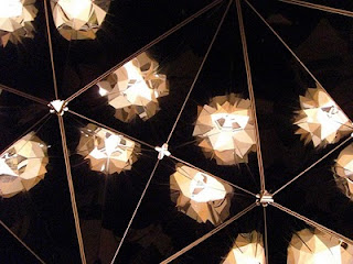
Olafur Eliasson: Multiple Grotto (Interior view)
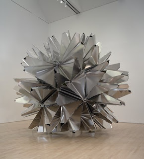
Olafur Eliasson: Multiple Grotto

Olafur Eliasson: Take Your Time
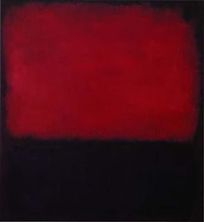
Mark Rothko: No. 14, 1960


